April 27, 2024

A Sketchbook Workshop with Susan Moss

Last week I took a three-day workshop with Susan Moss on "The Creative Sketchbook." I've long been intrigued and also intimidated by the idea of a sketchbook practice. I've tried several times to work in sketchbooks, but have never been managed to persist. I knew Susan's work through her embroidered drawings, which I find deeply moving. When I saw she was offering a sketchbook workshop, I decided to give it a try and see what might happen. I was confident that the work itself over the three days would be interesting, fun, and challenging, and if it ended there, that was OK with me. But I am taking home with me more than the sketchbook and ideas for continued practice. I also found a renewed energy to put art-making central in my daily life, an idea for a new project, and an interest in trying out some new materials. Here are some images and descriptions of what we did.

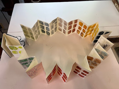
Susan provided a small Moleskin Japanese album sketchbook (accordion style, each page 3.5 x 5.5") for each participant. She also provided a huge array of paints, brushes, pencils, pens, charcoal, papers, etc. for us to work with; this was part of her encouragement to us to experiment--to try out new materials, marks, and methods. Experimentation was so much easier with the huge variety of materials that she made available to us. She also encouraged us to start out by painting color "swatches" on a number of pages in the sketchbook, using a wide brush and gouache paint. The swatches eliminate the dread of a totally clean page and the fear of what to put on it--just start by making some short brushstrokes on the page! And the swatches also give you a structure to work within/outside of, or not--it's also fine to ignore them while working over them. You can see an array of swatches across the sketchbook in this photo:

Susan provided a booklet of handouts that included prompts for drawings, prompts for reflective writing, and reflections on drawing and art in general by a variety of artists. She emphasized the importance of reflecting on what we were doing, and on our own histories of our relationship to art making. I probably spent about a third of the time writing, and two-thirds drawing. 

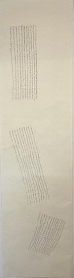
And now some examples of the sketchbook pages. In the photo below, the four swatches on the left hand page were drawn on in response to the prompt: "Make a series of small, simple marks, filling/exploding some painted swatches." The column of three swatches on the right were done to this prompt: "Using your non-dominant hand, make some lines vertically or horizontally on painted swatches." 


There had been earlier prompts to draw horizontal and vertical lines across swatches, varying pressure, density, spacing, and weight. With no hand specified, I of course I did those with my dominant (right) hand. I much prefer these lines done with my left hand! So much more intriguing, without the guidance of the purposeful right hand. (You can click on any image to enlarge it.)

Another set of prompts encouraged us to explore "the humble, magic pencil," varying the marks, and to also try smudging. I tried out ten of the many kinds of pencils Susan provided. My favorites were the Mitsubishi Uni 9B and the General Charcoal pencil. I also like the last line, where I drew with the blending stump that I had used to smudge the charcoal. 


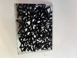
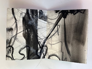
The prompt for this next sequence of three pages was to make a gesture with just a simple movement of your hand (I used a quick E-type shape), and then vary it in size/density. It was illuminating to see how much more interesting the drawing was in the densest version, on the right. I also liked the varying quality of the line I got using a reed pen, a drawing tool I knew nothing about before this workshop; it's now on my Dick Blick shopping list. (One of the many nice things about living in Galesburg, Illinois is that it's the home of Dick Blick Art Supplies, and one of their stores is just 10 minutes from my house.)


The prompt for the middle panel below was to "draw your grocery list." I especially like the drawing of boy choy, one of my favorite vegetables.  The column on the right was trying out a white gel pen along with black ink.


Here's another favorite--using the technique of a blind contour drawing (keeping your eye on the object being drawn, not looking down at the paper at all while you're drawing).  The first drawing I did is on the right (on top of blue swatches). The prompt was to do a blind contour drawing of some objects close at hand on my table. This is a pair of scissors, resting on a glue stick, with a bull-dog clamp below it. I love how you can make a reasonable guess at what the objects are, but the quality of line is much more free and loose than you could do if moving the eye back and forth between the object and the drawing. The other drawings to the left are the same objects and method, but done with my non-dominant hand. No verisimilitude left here, but some very interesting lines that, again, I couldn't have drawn if I was trying.


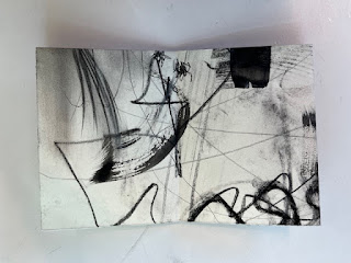
Another way to produce interesting lines and groups of lines by a combination of intent and chance: The prompt here was to make large gestures with black paint, ink, charcoal, etc. on a large piece of paper (18" x 24"), and then to have another person add something to what you did. I was the one who drew first on this piece of paper, including the strong vertical line and other brush strokes, the jagged marks done with a fat stick of charcoal at the bottom, and the smudges at left and right. The wiggly lines and the thinner pencil marks were made by another person in the class. Then the sheet was folded into a booklet, so that you see just one section at a time.


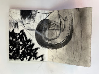
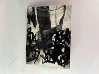
Here's the sequence of 8 pages that resulted from these unplanned crops. Susan encouraged us to look for a "story" in the sequence that unfolds.


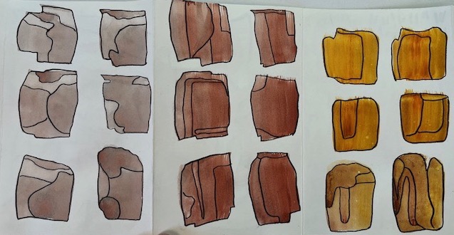
I've saved for last my favorite pages, which I've enlarged for better viewing. I had run out of steam towards the end of one day with doing the prompts provided by Susan and was just looking at a spread of lovely gray swatches in my open sketchbook. I picked up a marker and began outlining the swatches and the shapes within them, as formed by the changes in value as the paint dried on the page. I love so many of the shapes that emerged from this simple drawing gesture. And once again, I'm stunned by what can happen by mixing a lot of chance with a little bit of intention. That is, I was the person who made the gray swatches, purposely making some with two strokes, some with one, varying the pressure a bit, and not trying to even out the color across the swatch. So, a value variation as they dried was expected, but the shapes those took were entirely out of my control, and I wasn't thinking about it in any case. But then, looking later, my attention was caught by the variation, and I began tracing the lines, a pleasant activity, which then brought shapes forming before my eyes. These are shapes I could not have drawn on purpose. But it's also possible that now, having formed these shapes by accident, I can use them as inspiration to draw other shapes with intent/purpose--in the same family, perhaps, but different. I am eager to explore this further.


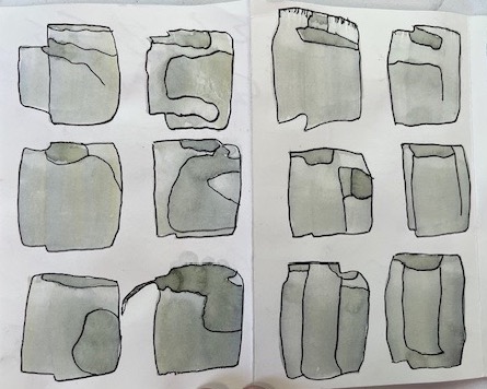
And here are a few other pages where I continued outlining found shapes. I had to hold myself back from doing nothing else for the remaining time we had!


So, many thanks to Susan Moss for a fantastic workshop, and also to my fellow students for their inspiring work. Susan gave us a scaffolding for our work (the format of the sketchbook, the prompts) that provided multiple starting points, while she also designed the workshop so that students were free to follow their own ideas, inclinations, and styles. She insisted that we look in the work for what pleased us, and not to worry about anyone else. Even while she talked individually with each student over the course of the workshop, she did not go around the classroom systematically to give comments on individual work, and the writing exercises we did were explicitly for our own eyes only. At first this disturbed me, because I often work out my own thoughts in conversation with someone else looking at my work. But I came to see the importance of this tactic. It made me listen carefully to my own thoughts and feelings about the work and to proceed from there. 


April 3, 2024

Two small half-square triangle quilts

In my last post, I mentioned that I had embarked on a stretch of doing simple sewing, and I showed a number of samples of quilt patterns I was considering.  Thanks to those of you who wrote back with your favorites!  I decided to make Katie Pedersen's "Cross the Border" quilt. (Katie's blog, Sew Katie Did, is one I've been following for a long time, and I highly recommend it.) I followed her design closely, using a hand-dyed fabric for the background and a variety of prints, about half of them from my scrap bins and the rest clipped from yardage on hand. It's satisfying to make a quilt without having to buy any new fabric. 

"Cross the Border" pattern by Katie Pedersen, Sew Katie Did blog; my version is about 35" x 45."

A regular zig-zag is a standard quilting pattern, but I love Katie's energetic version of it, with the variation in the beginnings and ends of the lines--brilliant!  I also followed Katie's lead in using a wide variety of prints, in both color and pattern. With this many different small pieces (over 150 different fabrics), you can get away with more variety than if you're using a smaller number of different fabrics. For example, I wouldn't think of making a quilt with just the four fabrics below, but they look just fine as one of many (in the top line of the quilt).

One of the pleasures of making a scrap quilt like this is looking through one's stash of fabrics, and coming across fabric from past quilts. The green check below is from the first quilt I ever made, with Katie Ortner.


I've made several zig-zag quilts before as baby gifts, but I've always taken the easy way out and used rectangles for the units. (If you click on the photo to enlarge, and look at the solid pale green fabric, you can see how the rectangles are laid out.) 


After making Katie Pedersen's version, I don't think I'll ever go back to rectangles. Half-square triangles take more time, but I loved mixing up the fabrics in each zig-zag.

Given how much I enjoyed working with the HST (half-square triangle) blocks, and while the fabric was pulled, I decided to do a sampler quilt, showcasing a variety of patterns you can make with this simple combination of two right-angle triangles. I kept in a zig zag (upper left in photo below), but then did eight other traditional blocks. This top is about 40x40".


And my HST playtime continues. I'm now working on a more free-form design, using a palette of colors and pale neutrals chosen by a friend of mine. I'll post more once I've got something to show.


February 18, 2024

Working on easy things for a while

For some months, I've been spending a significant amount of my time and mental energy in helping out several people among my friends and family who could use a bit of help for one reason or another. I've done a small amount of thinking/sketching/trial stitching for my projects on standing stones during this period, but haven't been able to put in the time or mental concentration that are needed to move the projects forward. I've decided to just let them stay quietly in the background for a while, and to stop feeling frustrated about not getting to them. They will still be there whenever I feel ready to pick them up again, and I've decided that's fine. I've lined up some small, easy projects that I can do with time in the studio. These will give me a chance to spend quiet time on my own, and will give me the pleasure of working with colors and shapes and of seeing something finished fairly quickly. Eventually this will likely get a bit boring, but for right now, it's working well. 

I've finished up the 4-patch posie quilt shown in this post, piecing a back and then sending it off to Trace Creek Quilting for them to stitch a simple overall pattern on the quilt. I usually quilt my own quilts, but sometimes turn over to a longarmer larger quilts that are going out as gifts (as opposed to art quilts, made for myself, all of which I quilt on my home machine). I was very happy with the process of working with Trace Creek, and with the results. I thought I'd miss the in-person interaction with the person doing the quilting, but it actually worked well to take my time deciding on a few possible quilting designs from their website, and then phoning to get advice from the owner. When I sent in my quilt, I enclosed a sample of the color thread I wanted used, and they came up with a very good match. The cost was reasonable, even taking into account the cost of shipping both ways.

I've recently made several lined tote bags, adapting this "Whitney Sews" pattern. I enlarged the dimensions a bit, and used quilting cotton with medium-weight fusible interfacing. (You can click on the photo below to enlarge.) Drop me a note if you'd like to know how I changed the pattern.
 

I started by making just one for a gift that's coming up, but I liked it so much that I made a few more to have on hand. I made the bag once before a while ago, with just a light-weight fusible, to use as a knitting bag, and I have enjoyed using it, but I think this version with a heavier fusible will be even more usable, as it is stiff enough to stand up on its on, while still flexible enough to be folded up and packed away, if desired.

I also plan to start working on a simple quilt, with straightforward, repetitive piecing, which is what I feel like right now. Here are some possibilities I've lined up. I know the quilt called "Lilla" doesn't quite fit the description, but it's still in the running. I'd be curious to know which of these you find the most appealing.
 

November 13, 2023

Workshop with Jane Davies, Part 2 (work on menhirs)

I last wrote about my second planned piece neolithic menhirs back in August, here.The first thing I did when I turned to this project again during my second week at the Jane Davies workshop was to draw a full scale sketch of a composition, using a roll of newsprint I'd brought with me for this purpose. I knew the facility would have ample wall space available for this, and it's more difficult to do on my design wall at home which is large enough, but is composed of foam core covered with flannel, not too good for drawing. 


This drawing is not in any way final, but I was glad to see an image in something like the size I am want to end up with (about 90" high). This is enough to serve as a placeholder, while I go on to work through the details of the composition. I am still at the very beginning of this process.

From there, I wanted to experiment with color. When I last worked on the project in my home studio several months ago (when I was thinking of four shapes rather than three), I'd cut out the menhir shapes from hand-dyed fabric I had on hand:


But this left me dissatisfied, reminding me of the challenge I'd faced before in making abstract work about stones, which are already such simple shapes. Of course, another possibility would be to move away from abstraction, towards a more realistic approach. But I'm not drawn to that for my own work, even while I much admire the superb work in this vein by quilt artist Denise Labadie.

In my previous work about stones, I got to abstraction by focusing on color only, resulting in the piece "Holiness." So, I started thinking that maybe for this piece, I would focus on shape only, and not use the natural colors of stone. I looked forward to the workshop for the time it would give me to experiment, and the tool of collage for coming up with possible colors and arrangements. I decided to try colors very far away from natural stone colors, thinking this would bring the focus to shape; I used a mottled black for the background. Here are the resulting 11x14" maquettes, with the second one pulling the shapes apart a bit.

And since one of the demos at the workshop was about texture, I decided to test out texture (and shading) on one of the shapes.


While I felt engaged in these experiments as I did them, I didn't feel gripped by the results, and I would now say they were a dead end. Indeed, I'm embarrassed to even include in this post the collage sketches in green-turquoise-magenta. But I know that once the work is finally done, I'll be interested to look back and be reminded of the paths not taken. I may hold onto the possibility of some kind of texture, but the bright colors are definitely out. So the next steps will be more exploration, sketching, and testing. I have accumulated a pile of books about Giorgio Morandi to look at. His quiet, simple, forceful still life paintings are deeply moving; I think I will learn much by looking closely at his compositions.

And I find myself also looking back again at the stitched drawing of two stones that I made back in about 2015:

21" x 11"

And I also keep looking at this pencil sketch that I made during the workshop, in preparation for the large-scale drawing (click to enlarge):

11" x 14"

Who knows, maybe I'll end up with a large-scale black and white drawing of some kind.  

I'm thinking I will continue to work on this piece until I come up with what seems a promising direction, and then put it aside for a while as I go back to "Persistence," the first menhirs piece, for which I prepared the fabric this summer. The earth pigmented fabric has now cured, and is waiting for the stitching to begin. . . Once the stitching plan finalized and the contemplative stitching begun, I'll be able to come back to the second piece. I just can't do hard thinking about two big pieces at once.


November 11, 2023

Workshop with Jane Davies, Part 1

I spent the last two weeks of October in a workshop with Jane Davies at the Crow Barn in Ohio. The workshop was on "The Elements of Visual Language: A Fresh Look at Abstract Composition," working primarily with drawing, acrylic paint, and collage. You can see Jane's own work here; her youtube channel has many tutorials and online workshops. From sampling these before the workshop, I knew that Jane's methods of working as well as her materials are very different from what I'm used to, but I thought a change of approach would be a productive challenge for me, and thinking about composition is always a good thing. I was also eager to do more work with collage, which I've tried out a little bit before, and which I'd like to use more for making cards. I also thought it could be a useful medium for doing small "sketches" for my second menhir project (the one that will focus on three standing stones), making it easier for me to try out different colors, shapes, sizes, placements than using fabric. And all this held true. I made some interesting work while I was there, using media in ways new to me, and I also made some progress on the menhirs project. And when I got home, I cleared off my "project" desk in my study and set up my collage supplies so they are in easy reach.

Jane's approach was to focus on various elements of composition. An early assignment was to use line only. The first mark I made was the heavy line below. I added other lines, trying out other drawing tools/color:

9 x 12" on Bristol paper

That primary line was intriguing to me, so I explored it in another assignment, which was to work with both line and shape. I like both of these compositions, especially the one on the left, with the coral-colored circle.


I had an exchange with Rick Ortner after the first day of the workshop, describing Jane's approach, and wondering how useful it would turn out to be for me. Jane starts with spontaneous/random marks, while I tend to start from a central idea or emotion and then look for marks that will express that idea/emotion. Rick replied, "Starting from random operations is not bad. . . As long as you think formally, you can generate tons of new structures--structures with metaphorical resonances." These early drawings showed me just what Rick was talking about. Something about this looped line is very evocative to me, even though I can't identify a particular meaning in it. It somehow seems to me both menacing and comforting. I can imagine continuing to explore it, even perhaps in a large textile work.

Some technical information about the two drawings:
  • The scribbly line work was done in a new method I learned from Jane. I drew line clusters with a variety of implements (markers, graphite) on regular tissue paper. When the rest of the composition was in place, I auditioned various line clusters over the composition, cut out a rectangle of tissue with the cluster I wanted, and applied it to the collage with matte medium. Voila! One gets a line that traverses other materials with no skips or hesitations, and the tissue paper is transparent, so doesn't show. Another benefit of this method is being able to audition various lines; if I had been drawing directly on the composition, I would have had only one chance.
  • The prominent looped line and the other solid shapes were cut out of hand-painted collage paper. The paper is inexpensive drawing paper (e.g. white sulphite drawing paper from Blick's), and the paint is artist quality acrylic paint (Jane recommended Golden fluid acrylic paint). (Craft-quality paint does not give as solid a coverage.) Here's an array of the paper I painted:

Some other compositions that continue to appeal to me (these five are all 9x12"): 


On the Sunday between the two weeks of the workshop, I brought some materials back to my lodging and made a dozen or so cards. I enjoyed using techniques learned in the workshop on this small scale (4x6"), and look forward to replenishing my stock of hand-made cards with more along these lines. 


The different-looking one in the bottom right is just a rectangle cut out of the piece of newsprint that I had on my work-table to catch the paint where I went off the edges when painting 9x12 pieces of drawing paper. When I finished an extended session of painting papers and went to clear off my table, I noticed how beautiful these lines were. I got a half-dozen cards out of that one piece of newsprint. Another piece of newsprint is show below, but this one did not happen to yield such beautiful lines.  


In the second week of the workshop, we had the option of working on our own projects or continuing to do assignments suggested by Jane. I did one more day of assignments, and then switched over to working on my second menhirs project. I'll write a second post about that work. 


September 14, 2023

Simple Sewing

I like to have simple sewing to do, alongside my work on more challenging projects. The intellectual/creative work involved in big projects (like my current ones about menhirs) has, of course, its own satisfactions, but each of those projects takes a very long time (usually years) to see the finished results of the endeavor. Here are a couple of simple projects that I've worked on recently.

When shopping with my sister in July at a quilting store in Phoenix, I saw a Kaffe Fassett fabric called "Twig" that I really liked (reminds me of Matisse cut-outs), but couldn't imagine how I would use it in a quilt.

Cookie said, "Why don't you make an apron with it?"  Good idea, especially as I already had a pattern at home that I'd been wanting to make. Although it looks like a dress, this Indygo Junction pattern is open in back, and the apron is put on over one's head.

I made the apron while on an annual quilting retreat with friends, in Plainfield, IL.  I also worked on another four-patch posie quilt that has been in the works for a while. Here's a length of the fabric that I cut up to make all the blocks,

Grafic by Latifah Saafir

And here are the 48 different blocks that came out of the fabric, framed in red or charcoal, and sashed in blueish-green. I haven't made the back of the quilt yet; it will incorporate the length of fabric above, so that the recipient can see where all the design elements came from. I'll probably use the charcoal fabric for the binding of the quilt.


And on the menhirs front, I've been reading a collection of essays on Soils, Stones, and Symbols: Cultural Perceptions of the Mineral World.


August 30, 2023

Progress on "Persistence"

In my earlier post on "Persistence," I mentioned that Sheryl St. Germain would be coloring the background cloth for the project in late August. Last weekend, she travelled from Georgia to come work with me in my basement studio. We chose my studio because I have a very large print table (about 60 x 95"), large enough for the piece of fabric I wanted to work on. I know the piece will be about 90" in length. I'm not sure of the width yet, so we colored the full 57" of the natural linen I'm using. Here's Sheryl at the print table, after we'd put one coat of earth pigment on the cloth.


Here it is drying on my concrete driveway. The warm weather helped it dry quickly, giving us time for a second application later that day.


Here it is back on the print table, after another coat of pigment, done at double the strength of the first coat, to insure we got to the dark value I was aiming for. I've turned over part of the fabric so that you can see the back as well (click on the image to see details). The pigment penetrates to the back, but doesn't cover uniformly as it does on the front, and the patterns can be quite lovely. In fact, many people who use earth pigments use the back side for their art work. I'm going for a solid background, so I'll be using the front. Although I do find myself looking also at the back. . . The fabric has to cure for four weeks before I can stitch into it, so no need to decide now.


Sheryl and me in front of the cloth:


The cloth will be the base for extensive hand stitching. You'll find more about the stitching in this earlier post, and an explanation of how the piece is connected to my experience of neolithic standing stones, in this post. And for a look at the range and beauty of work that can be done with earth pigments, take a look at this collection of images of student pieces--including one by Sheryl--from a recent online class taught by Claire Benn.

Looking with Sheryl at my preliminary pencil sketch for the piece, we decided that a vertical orientation will be best. (I oriented the image horizontally in my earlier post.) Much work remains to be done to figure out details of the stitching and layout, but having prepared the base cloth is a very significant step forward.